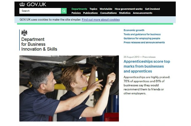
I am a full supporter of GOV.UK. I love the way content is presented: if you’re a citizen or business coming from Google and wanting a straightforward, well written answer – you get it.
I love that Inside Government has challenged colleagues to think about how policy is presented, turning it into something anyone can read and understand. I love that ‘topics’ are no longer in department silos but are visibly joined up.
I also love that the site is constantly improving; long gone are the days of gazillion pound projects to refresh design or improve a clunky CMS.
Yet it seems every week, we in departments are faced with less-than-favourable comments from some stakeholders or other civil servants. When the grumbling is specific - “I can’t find ….” or “that sentence is factually incorrect” – we can deal with it quickly, problem solved.
What’s still proving to be a problem, and a real distraction from our day jobs are the general negative comments where people don’t quite give a specific example but just say “it’s hindering delivery” or “not as good as the old site”.
We know the site is constantly iterating and big things like search have been improved but something is missing. What are the user needs of civil servants or partners? When it won the Design of the Year award recently, why did the site get a sneer rather than a cheer?
My observations
Some people seem to have used the old sites as a management information tool – content pages were grouped in a nice neat package with all their publications, meeting minutes, Ministerial statements etc on one page or in one section. External users may have found this confusing and it may not have explained the issues and actions as clearly, but some civil servants really miss this ‘MI’ tool.
Departments are used to the traditional approach: creating a new piece of content to ‘broadcast’ government information, rather than thinking about user behaviour and the best way to reach a particular audience. It’s a shift in culture and language to get colleagues or partners to think: What are users looking for? Where are they having online conversations? Are third parties already providing some of this information?
There is definitely a clash between the need to deliver department objectives via behaviour change and the GOV.UK model of having very little ‘advice’ content.
However we can’t discount that civil servants and partners are users of the site too – and something is wrong with the GOV.UK model if we have to help colleagues find their content, use the filtered search effectively or understand what a detailed guide is for. A good site, no matter how well designed should be intuitive.
So what do we do about it?
Part of our team’s objective is to help embed digital within the department. We are trying to see every request or comment as an opportunity to explain how the site works, to think about user need and to get our colleagues thinking about how to articulate what the actual issue is - not just job done, move on to the next request!
We have resurrected our weekly Digital Surgeries and expect to deal with GOV.UK questions as well as normal social media queries.
We still need help from GDS to sell the good story about GOV.UK. GDS blog posts are great but we also need a good ‘old fashioned’ paper or slide pack that can be circulated - sharing great findings of user testing, examples where pieces of content have been improved based on user feedback and data, and how the site is continuously improving.
We also need to share with colleagues the wonderful world of the non-government web and the potential of using other websites, forums and channels to help broadcast messages and engage with our audience.
I would really like to hear your views – especially from digital colleagues in other departments about how you are dealing with the internal feedback.
Stay up-to-date by signing up for email alerts from this blog.
2 comments
Comment by Jill Rutter posted on
Hi Gwenny
we have sent pages of specific complaints to GDS team
but the problem is both missing documents, lack of structure and extreme dumbing down of content. Plus depts not updating stuff - which is difficult to track when you have to resort to Google because the internal search engines don't work. (the BIS organogram was a case in point.. we could only fxind one for 2011)
this is far too blase about something that is undermining transparency, accountability and in the future, knowledge management.
it needs an objective strategic rethink
Comment by Tim Blackwell posted on
i Some people seem to have used the old sites as a management information tool – content pages were grouped in a nice neat package with all their publications, meeting minutes, Ministerial statements etc on one page or in one section. External users may have found this confusing and it may not have explained the issues and actions as clearly, but some civil servants really miss this ‘MI’ tool.
Belatedly, some external users *loved* this, though admittedly we didn't know how much we loved it until it was replaced by the ghastly car crash of Inside Government: the website that took the DNA of government and smashed it back into the primordial soup.