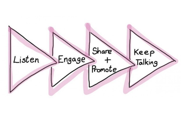
One of the best elements of Digital Fortnight for was producing our guidance for policy makers on how to use digital as part of a more open approach to policy making.
Listen, Engage, share & promote, keep talking structure shown above (and the lovely hand drawn logo) owes most to my colleague Gwenny. And it has become a useful shorthand way of demonstrating the behaviours we're trying to promote - hopefully getting people away from thinking about tools and channels to what they're trying to achieve. And realising that they don't have to immediately jump in to direct engagement if that's not for them.
We talk about our little model as the sideways Christmas tree. And for me, gathering evidence is the common thread that runs through all stages of engagement.
I was keen from the outset that the guidance be about more than just the consultation phase of open policy, that it get beyond the 'making' which sometimes makes up relatively little of policy makers' day jobs. Yes, digital engagement can really come into its own during consultation and review processes, but real embedding will only come when it's normalised in the day to day aspects of a person's job.
So, I deliberately set about thinking how I had used digital in my old policy job, and how I might have used it (knowing what I know now!) in some of the various bits of my previous roles. The key themes are very much a reflection of my experiences, but also based on how we have actually seen other policy types using digital across the department - from teams briefing during consultations, to the science and society team using social listening during the current public attitudes to science work, and a few policy officials really embracing being part of an online community by live Tweeting conferences (I'm particularly fond of that last one as it's where I found my digital stride!)
The microsite came quite late in the day towards launch. For WordPress aficionados and people who like to know these things, it's just built on the simplest 2010 theme, as opposed to Steph's commentariat theme that we've used previously.
For most of the summer in the run up to Digital Fortnight, I'd been envisaging a slide pack embedded in a single post in this blog. Bit that just didn't work for a number of reasons - the current structure is a lot more flexible, and will mean that we can keep our promise to add more content as it's requested.
We've had some great feedback so far - although a lot of that has admittedly come from outside the department. Where we've had the chance - in our extended "go digital' and individual team sessions, it has been really well-received, and the guidance on briefing seems to particularly resonate - causing a couple of the lightbulb moments that I've blogged about before.
Now that Digital Fortnight is complete, we will see a shift to ensuring awareness and use of the guidance, and developing it further as we establish what works and what doesn't. So watch this (or more correctly that) space!
Stay up-to-date by signing up for email alerts from this blog.
2 comments
Comment by Steph Gray posted on
I think the hand-drawn model is a masterstroke, as is the use of a default theme.
There's an important but subtle point being made that the best bits of digital engagement are about the human touch, a willingness to experiment on the cheap, and come up with practical bits of clear thinking - not necessarily a URL.
Comment by James Devenish posted on
Thanks. Really useful post and love the diagram. So important to remember the purpose - why and what the real goal is in digital engagement.